3X more bookings within 8 weeks for a therapy clinic
With the new identity in place, Pure Harmony quickly saw higher enquiry rates and stronger social engagement.
Pure Harmony is a psychology and therapy clinic based in India, offering mental wellness support through in-person and online counselling. Their mission is simple yet powerful: make therapy feel safe, approachable, and stigma-free for anyone seeking it. They approached us to build a brand that didn’t just look calm—but felt human, honest, and deeply reassuring.
- Industry: Healthcare
- Solutions: Strategy, Visual Design, Branding, Communications
Challenge
Design away the fear. Make space for healing.
In mental health, the first barrier is often emotional. People don’t just choose a clinic—they choose whether to open up at all. Pure Harmony needed to show up with empathy, not authority. Their brand had to feel soft but credible, warm but not fragile. The challenge was to craft a visual and verbal identity that held space for people, not just marketed to them.
Approach
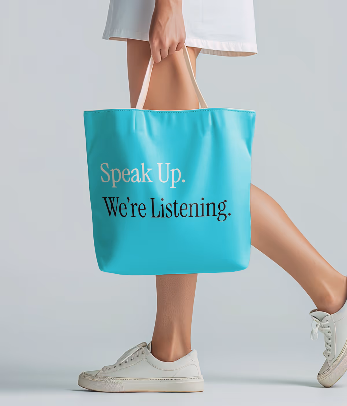
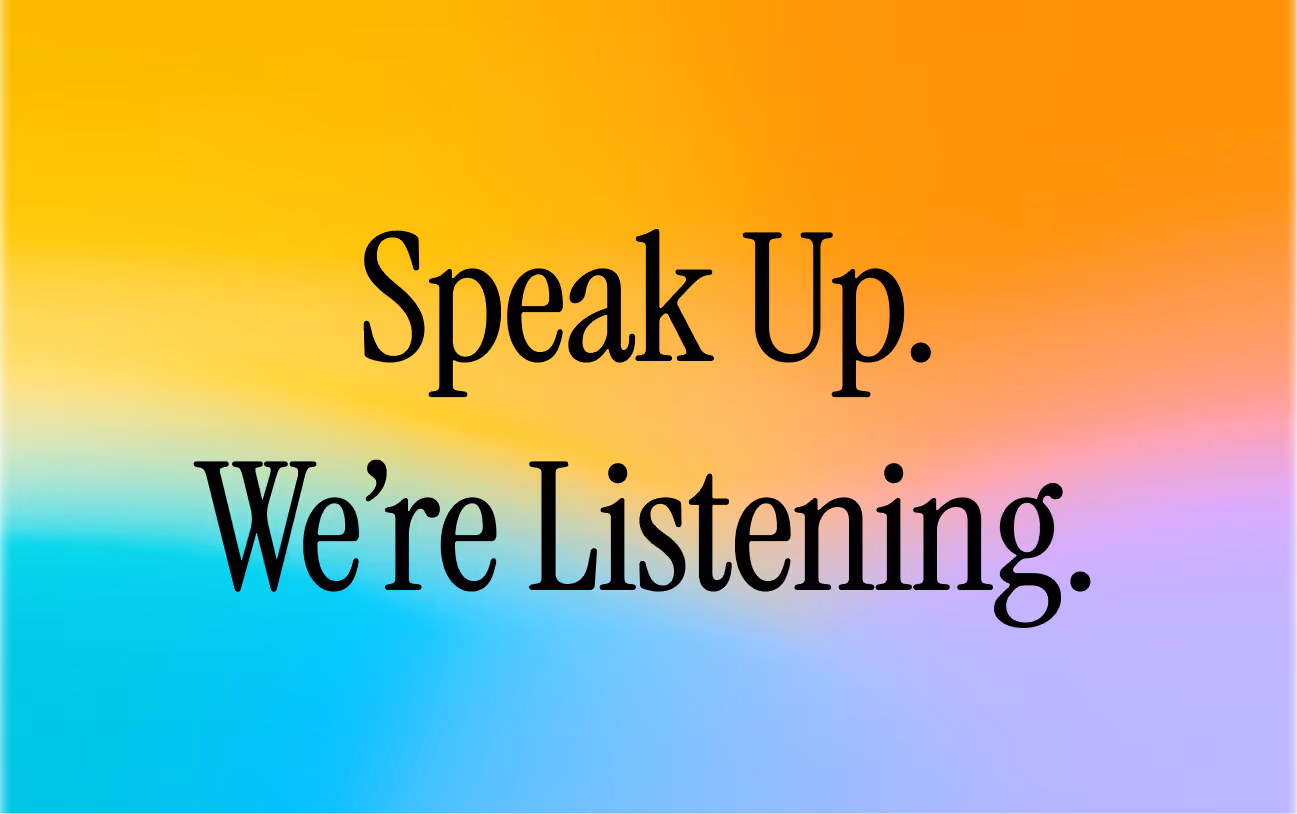
Brand softly. Speak gently. Feel human.
We started by understanding therapy from the client’s lens—what they feel before they even walk in. We translated that into a brand system built around calm tones, organic forms, and clean, breathable layouts. On the messaging side, we defined a voice that was supportive without being preachy, grounded without sounding clinical. Every post, every word, every visual was designed to feel like a gentle conversation.
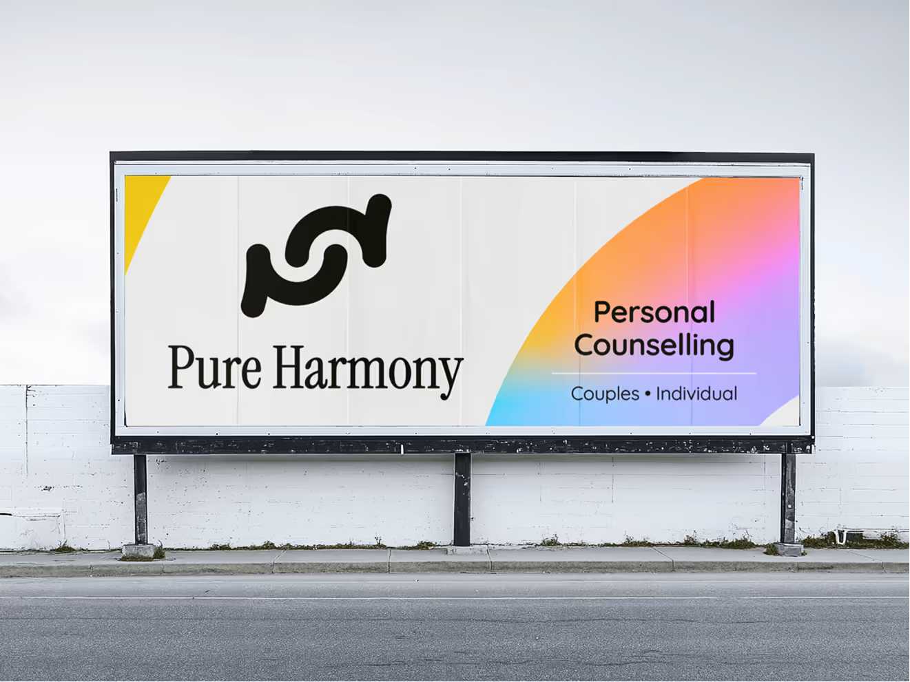
What We Did
Brand Identity System, Logo Design, Brand Communication Strategy, Social Media Content.
Impact Created
From blank stares to warm welcomes
With the new identity in place, Pure Harmony quickly saw higher inquiry rates and stronger social engagement. More importantly, people described the brand as “comforting” and “inviting”—just what therapy should feel like. What started as a design brief became a brand that people trusted with their inner world.
- 60% Rise in social media engagement within the first month
- 3X Increase in first-time session bookings