TWeG: A website built for consulting leadership
TWeG is a strategic consulting firm for SMBs
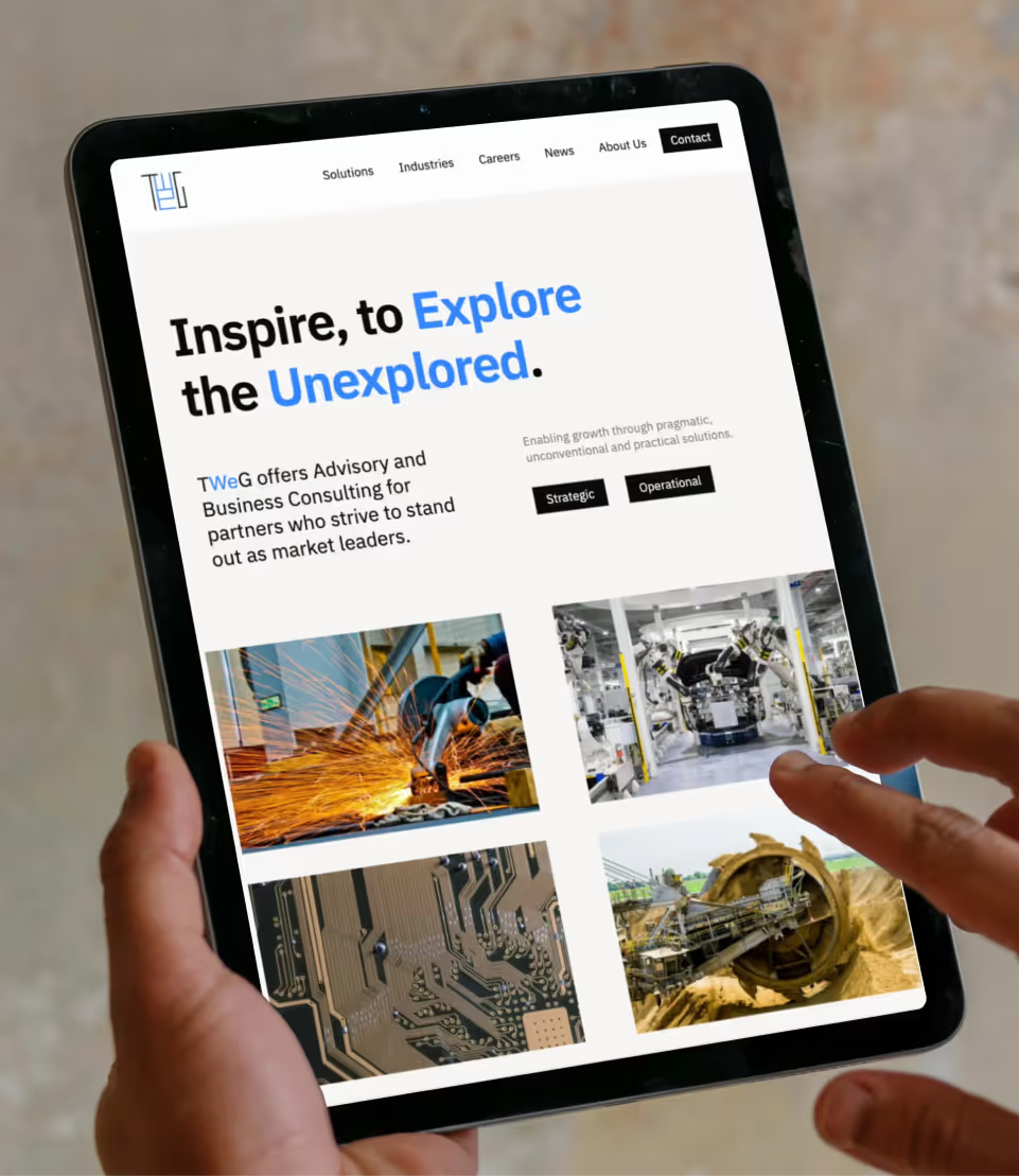
Grey Truffle delivered a responsive Webflow site with a minimalist brand identity that positions them unmistakably in the consulting space

TWeG helps businesses unlock growth through strategic planning and operational clarity. But their existing digital presence didn’t reflect that precision. Their website was cluttered, difficult to navigate, and heavy on words that said too little. They approached us with a clear expectation: simplify everything. They wanted a digital space that mirrors the way they work—structured, purposeful, and efficient. A website where every page, section, and word earns its place. This wasn’t just a design project. It was about translating the core of TWeG’s consulting philosophy—clarity, focus, and long-term thinking—into a digital experience.
Designing for Focused Growth
Our approach began with the fundamentals: information hierarchy and user flow. We mapped the entire site around how users actually move through it—not just what TWeG wanted to say, but what visitors needed to see, and when. We placed their services at the centre of the experience, with direct, jargon-free descriptions supported by strategic case studies. Each section was designed to deliver just enough detail—clear calls to action guiding visitors deeper if they wanted more.
Visually, we kept the design understated and deliberate. The palette is built around deep blues and soft neutrals—establishing trust, while avoiding corporate coldness. Typography plays a quiet but powerful role: bold headings create structure, while clean body text ensures readability across every screen size. White space became a critical design tool. It creates breathing room between sections, slows the pacing, and invites focus. The goal wasn’t to fill every pixel—but to let the right details stand out.
Built for Flexibility and Longevity
We built the site on Webflow, but beyond development, flexibility was a key design principle from the start. We created modular components and repeatable design patterns that make it easy for TWeG to grow their site over time—whether that’s adding new services, publishing insights, or evolving their case studies. The entire design system was documented for their team, allowing them to maintain consistency long after launch.
Responsiveness wasn’t an afterthought. We designed every page to adapt seamlessly to mobile and tablet devices—ensuring a consistent experience, regardless of how users access the site. Every decision was guided by long-term relevance. This isn’t a website designed for now—it’s built to last.
The Outcome
TWeG’s new website has redefined how they show up in the consulting space—clear, confident, and purposefully different from their peers. Since launch, the site has seen increased engagement from both prospective clients and existing partners. Visitors now spend more time exploring their services, and TWeG’s team has a scalable, easy-to-manage platform that grows alongside their business. More than just a website, it’s a digital reflection of how they work: thoughtful, efficient, and always focused on what matters most.


