Copied
Article
Discover smarter CTA alternatives for better clarity, context, and intent — designed to match how people actually decide to take action.
Design
Design
Design
Design
Design
Design
Design
Design
July 20, 2025
The smallest elements often carry the most weight. A call-to-action might only take up a few pixels, but it shapes how your users move, feel, and decide. And yet, many brands still settle for vague, placeholder CTAs like “Learn More.” It’s not just outdated. It’s lazy.
“Learn More” doesn’t clarify what you’re offering. It doesn’t reflect the page’s context or the user’s intent. It asks for attention without giving a reason. In an interface where every interaction matters, these kinds of general-purpose prompts dilute the entire experience. At Grey Truffle, we see CTAs not as buttons—but as moments of narrative closure. Each one should complete a sentence, spark a decision, or affirm a direction. Anything less is friction disguised as function.
The Problem with Generic CTAs
At a glance, “Learn More” seems harmless. But ambiguity is rarely neutral—it creates hesitation. First, it lacks specificity. When everything says “Learn More,” nothing stands out. Is it a case study? A service? A product walkthrough? The user has to guess. Second, it doesn’t offer value. There’s no clear benefit or emotional payoff. It simply passes the responsibility to the visitor. Third, it’s invisible. Not visually, but cognitively. People skim. They decide fast. A generic label doesn’t stop them, doesn’t pull them in, doesn’t invite trust. It fades into the noise. In short, “Learn More” asks the user to do more work—exactly what a well-designed interface should avoid.
CTAs as Experience Anchors
Good CTAs are never standalone. They don’t live in isolation—they complete a story. They give form to intent. And when crafted well, they reinforce both UX and brand voice in one clear line. This doesn’t mean every button has to be clever. But it should be deliberate. What is the user doing here? What are they expecting to happen next? The best CTAs answer that instinctively.
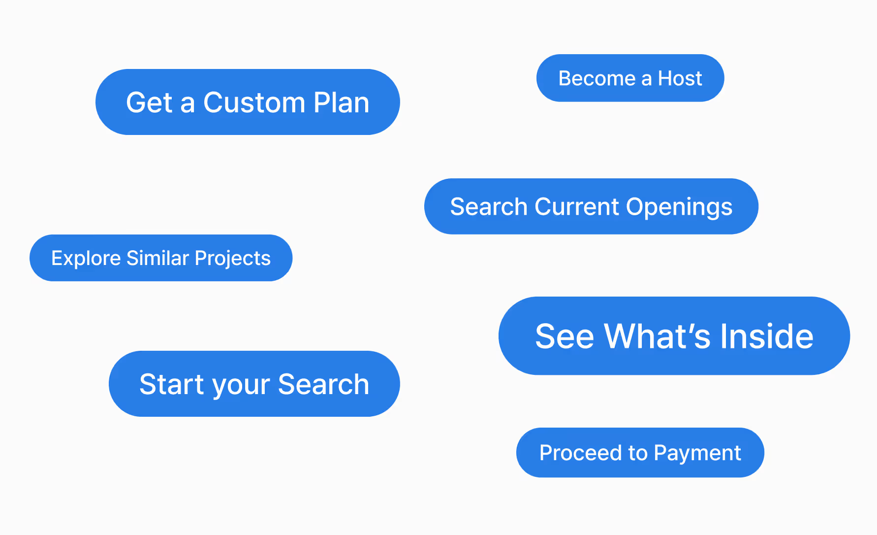
If someone is reading a service detail, don’t just offer “Learn More.” Offer “See what’s inside” or “View pricing breakdown.” If they’re browsing open roles, replace “Join Us” with “Search current openings.” These aren’t just better words—they’re better promises. CTAs should feel like progression, not placeholders.
Context Shapes Language
Context is everything. The same button can’t solve every use case. What works on a homepage hero fails on a careers page. What works in a blog footer doesn’t fit on a product comparison grid. Here’s how we approach CTA intent based on user mindset—not as a list of suggestions, but as a set of principles.
When someone is exploring
You need to signal openness. Curiosity. A path without pressure. The CTA should feel like an invitation to discover, not commit.
When someone is comparing
This is about clarity. Show them what they’ll get. Remove doubt. Lead with structure. Guide their next step with utility.
When someone is deciding
Precision matters. Whether it’s booking a call, building a quote, or downloading a deck, the language should feel assertive but effortless—like the next natural move.
When someone is engaging again
They’ve seen enough. Now it’s about deepening the connection. CTAs here should feel personal and confident. Less selling. More signalling trust.
These shifts are subtle—but they change the energy. They move a brand from looking helpful to actually being helpful.
CTAs Are a Reflection of Your Brand
A CTA is where strategy meets surface. It’s where your voice becomes action. A vague button doesn’t just weaken conversions—it dulls your identity. Think of how leading brands approach this. Notion doesn’t say “Learn More.” It says “Take a Tour.” Stripe invites users to “Start building.” Airbnb doesn’t sell rooms—it opens with “Start your search.” These are not just calls-to-action. They are extensions of the product, the philosophy, the tone. Language design is brand design.
At Grey Truffle, we advise teams to treat CTAs like micro-signatures—distilled, consistent signals of who you are and how you think. You don’t need dozens. You need a few that feel unmistakably yours, calibrated to the actions that matter most.
Strong CTAs Build Stronger Experiences
Design doesn’t end at the edge of a layout. It continues into language. Especially the language that moves people. If your CTAs feel like filler, the rest of the interface starts to feel performative. But when your CTAs show clarity, tone, and relevance, every touchpoint sharpens. The brand feels intentional. The product feels responsive. The user feels seen.
That’s what this comes down to—respect for the user’s time, attention, and momentum. A CTA isn’t just a button. It’s a promise. And the best brands know how to write them like they mean it.

Get on a call for your next project.
Share Details
Read how we transformed this brand.
View Project