Copied
Opinion
Here's our critical take on Apple’s upcoming Liquid Glass design releasing with iOS 26, macOS Tahoe 26, iPadOS 26, watchOS 26 and tvOS 26.
Design
Design
Design
Design
Design
Design
Design
Design
July 19, 2025
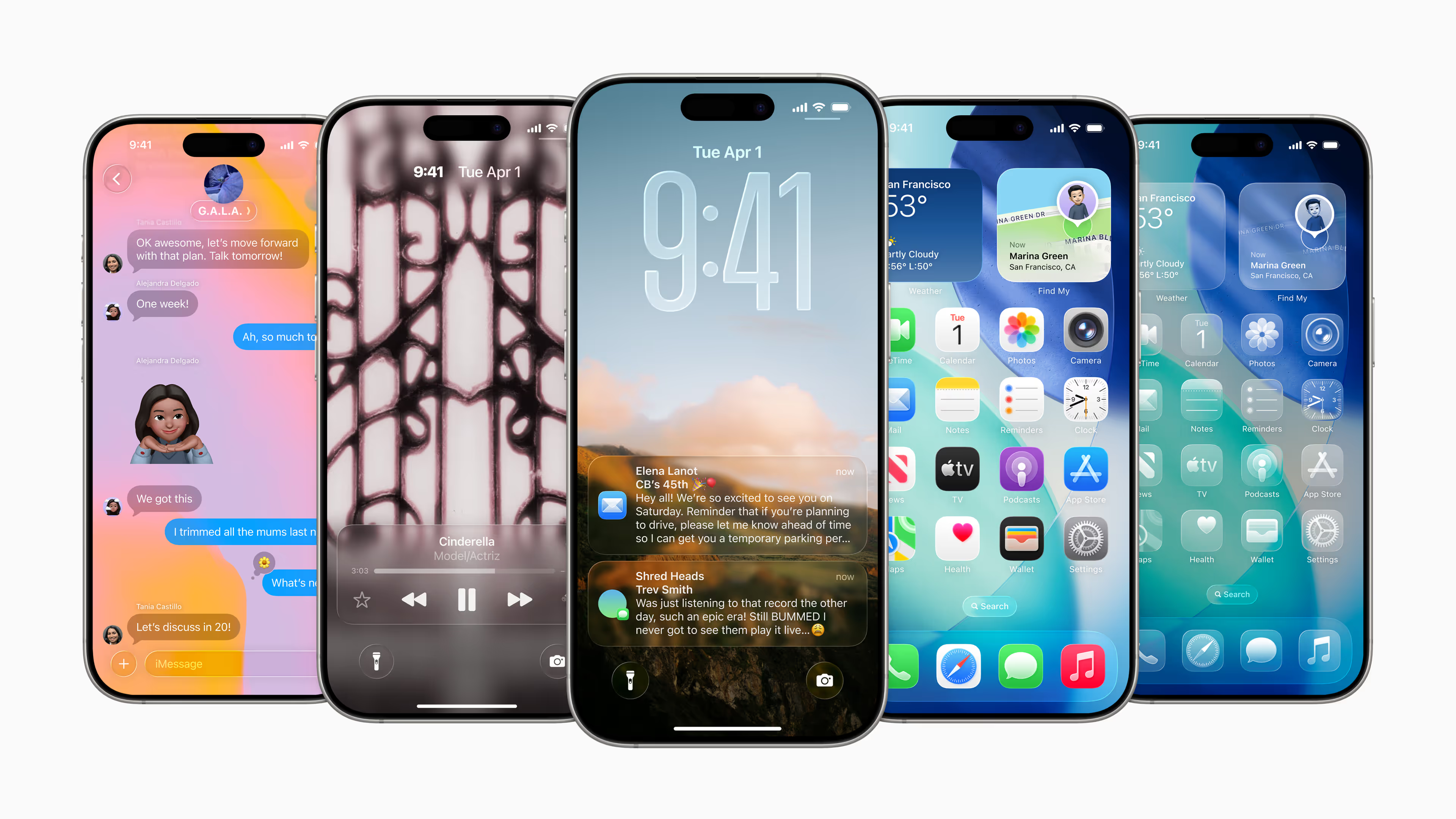
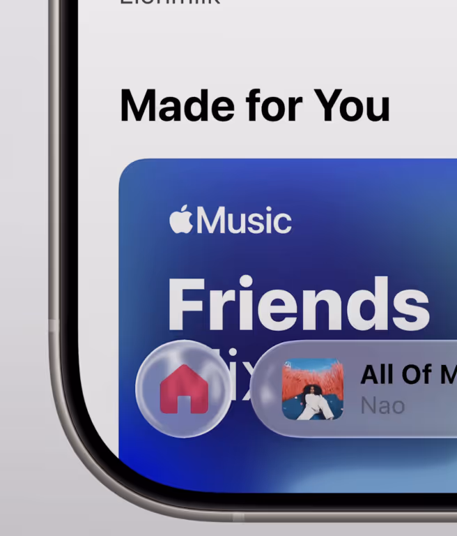
Apple’s latest interface evolution, Liquid Glass, has the internet split. Some call it stunning, others say it’s unreadable. Social feeds are packed with swipes, screenshots, and side-by-sides. Reddit threads are lit up with debates over transparency and contrast. In response, Apple adjusted the theme in iOS 26 Beta 3—less blur, better legibility. That alone tells you this isn’t a throwaway aesthetic. This is Apple making a calculated, long-term move. And as a brand consultancy, we’re not just looking at the pixels. We’re reading the intent behind them.
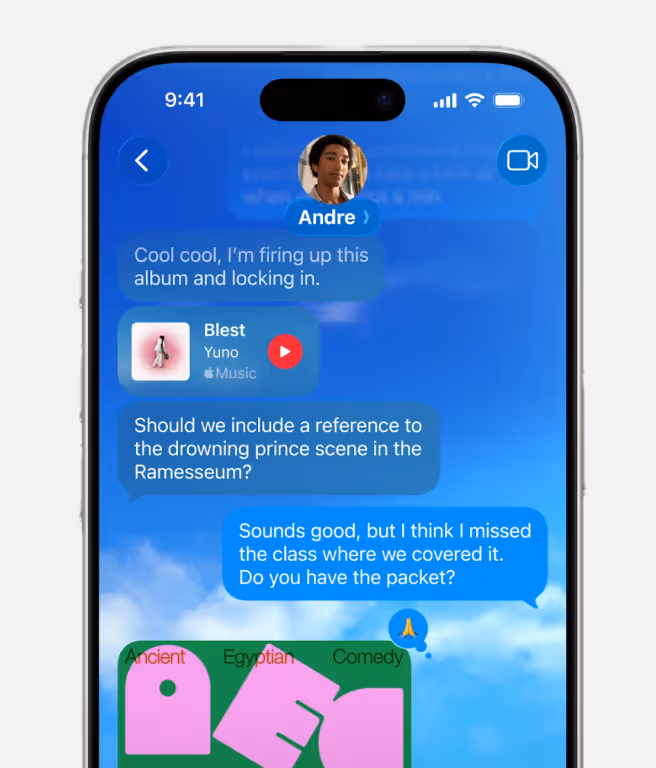
Liquid Glass is more than a new coat of paint. It’s Apple tightening its grip on the entire experience—visually, emotionally, strategically. This isn’t a UI update. It’s a brand signal. The interface now behaves like a living material. It bends, reacts, refracts. It introduces softness and stillness in a tech world obsessed with speed and sharpness. That shift—from performance to presence—is quietly revolutionary.
Apple’s brand strategy with Liquid Glass
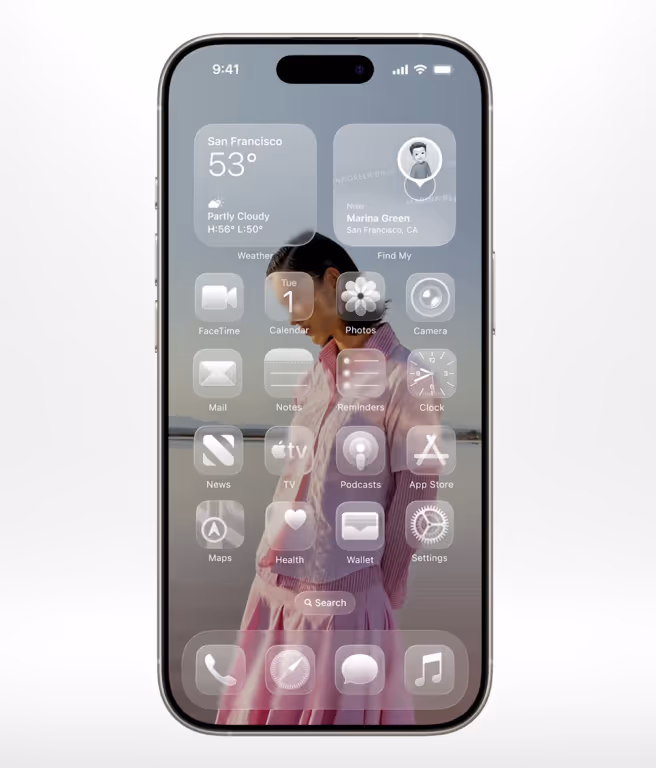
From a design standpoint, the implications are deep. UI elements no longer sit passively. They float, distort, respond to context. The effect is subtle, but powerful. It reintroduces visual hierarchy and depth without leaning on skeuomorphism. It doesn’t fake the real world—it respects the emotional qualities of it. Everything from the way buttons distort to how the Control Centre melts into the background is designed to feel tactile. This isn’t just Apple showing off its silicon. It’s Apple showing restraint, building an emotional connection through interface behaviour, not decoration.
At Grey Truffle, we see more than visual polish—we see a full system. Apple’s not just refreshing iOS. They’ve rolled out Liquid Glass across iPadOS, macOS, tvOS, and watchOS. That’s brand consistency at its most disciplined. It teaches users what to expect, no matter what device they’re on. For a company like Apple, with multiple platforms and millions of users, that coherence isn’t just design—it’s trust. It’s how visual language becomes part of the brand’s DNA.
Accessibility issues with Liquid Glass
But the rollout isn’t flawless. Accessibility is a real concern, and rightly so. Transparency may look beautiful on keynote stages and product pages, but in practice, it risks reducing clarity for everyday users. The early backlash points to a lack of visual balance—too much glass, not enough grounded UI. Apple has responded quickly, reducing opacity in core navigation elements.
But that’s not enough. If Liquid Glass is going to become a sustainable system, it needs to be adaptable. Contrast controls, reduced motion options, and real-time accessibility feedback should be baked in, not bolted on. The most elegant interface is one that works for everyone, regardless of how good your eyesight or screen brightness is.
Emotion - Apple’s new design language
From a brand perspective, though, the move is deliberate—and smart. Apple is repositioning itself, quietly but confidently. This design direction moves them away from the flat, utilitarian look that every tech brand seems to follow now. Instead, they’re leaning into softness, tactility, and emotional texture. It’s a return to design with feeling. And that feeling—the quiet shimmer of glass, the way it bends and breathes—is entirely Apple. It’s the kind of distinctiveness you can’t fake. That’s brand identity, rendered in real-time physics.
This is what great brands do. They evolve their design not just to keep up with trends, but to express where they’re headed. Liquid Glass isn’t just about how iOS looks in 2025. It’s about how Apple wants to be perceived for the next decade. Calm, responsive, human. Less about speed, more about presence. Less about function, more about feel. And for those of us helping other brands find their voice in crowded markets, it’s a powerful reminder that visual design isn’t just what people see—it’s what they remember.
In the end, this isn’t really a debate about glass, contrast, or motion. It’s a conversation about how design can carry meaning. About how the subtlest change in texture or depth can change the way someone feels about a product—or a brand. Apple knows that. And Liquid Glass is their way of saying it without needing to say a word.
No items found.

Get on a call for your next project.
Share Details
Read how we transformed this brand.
View Project